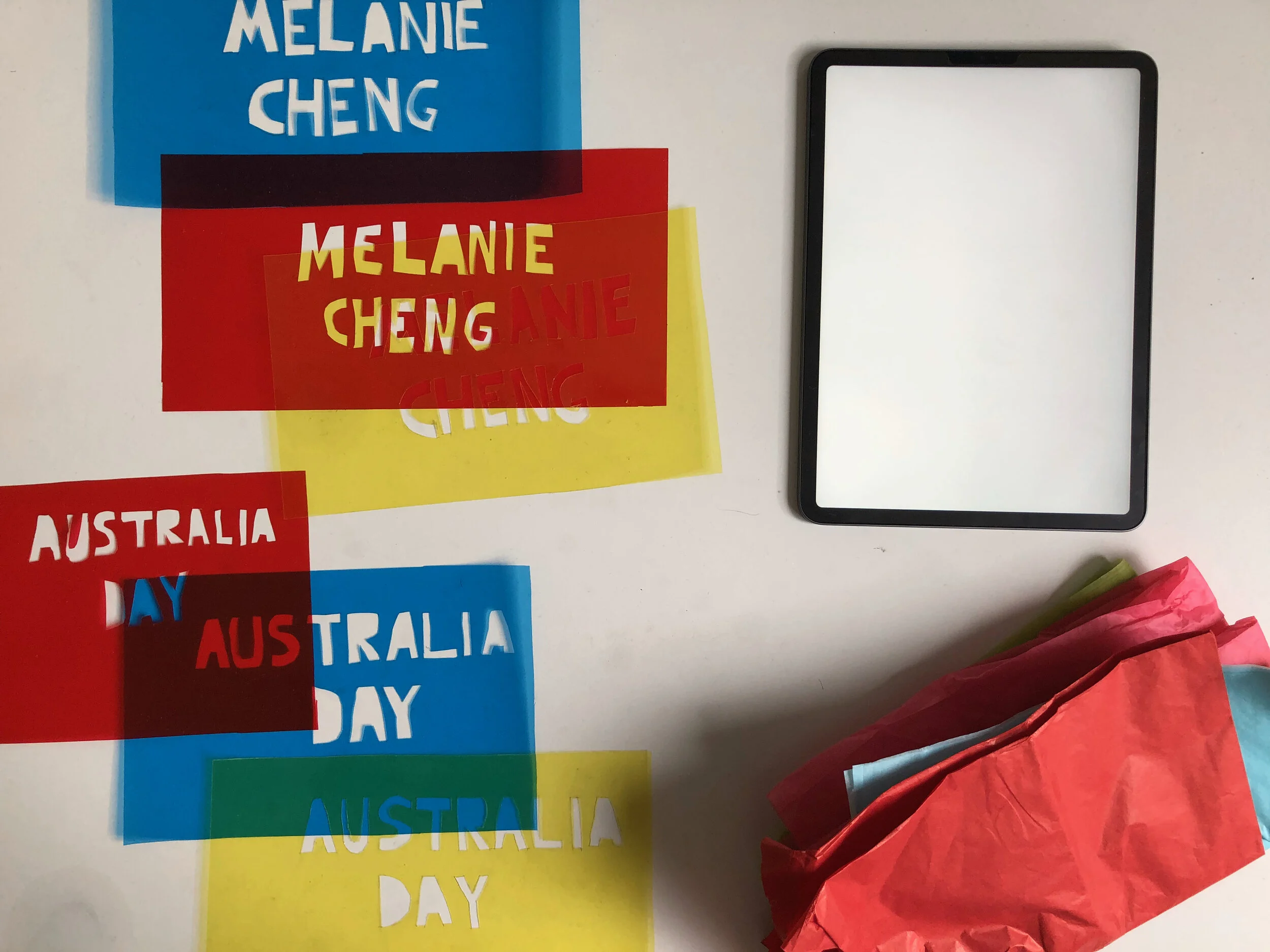
Playing with materials

Playing with materials
Australia Day by Melanie Cheng
The Brief
For this project, a selection of book manuscript was made available. Then, a book cover is to be designed based of the manuscript, as well as a digital promotion for the same book that can be posted through social media channels, all on behalf Text Publishing. Text Publishing is an independent, Melbourne-based publisher of literary and commercial fiction and non-fiction books. For this project, I chose to work on Australia Day by Melanie Cheng, a collection of short stories about Australians searching for human connection in an increasingly individualistic world. The stories explore universal themes of love and loss and family, at the same time asking important questions about identity, inclusion and belonging in a multicultural society and globalised world.

My initial idea to convey the concept of diversity and a plural society in Australia was to use multi-coloured neon lights to form typographic images. This was inspired by Peter Kennedy’s Neon Light Installations (1970-2002). There is a certain sensory experience of seeing light and sound intersecting into the physical space, as described by Kennedy. I resonated that description and interpreted it as the closest way of conveying my experiences of being a migrant living in Melbourne at the time.
“The way it struck me (when I presented Neon Light Installations) was that the air seemed to be coloured...it was a bit like walking through coloured air; being in the middle of a rainbow.”

As our assigned projects are typically a three-week sprint, I was not able to source neon lights to emulate my initial design concept. I reconsidered the elements that I wanted to express in the design, and turned to transparent, porous, coloured papers to achieve a similar intended effect. The hands-on process turned out to be the most fun doing design work I had for a long time, and reminded me of the joy of creating things.

With the combination of those papers, a light source and a dark room, I shuffled the papers around to form a variety of colours, texture and form that was captured on my camera. The photographs were then tweaked and enhanced to be used on the book cover as well as the accompanying digital marketing spaces for the final pitch.
DESIGNED FOR
Text Publishing, mentored by Jenny Grigg
Brief given in Advanced Communication Design Studio, March 2019 Semester


